Insights • Inspirations • Destinations • Design

Friday, February 24, 2012

Gardens, Films, Fantasies...


What is it about gardens that appeals to so many of us? (Even those, like me, who seem to have the black thumb of death when it comes to plants.) Why is it that if you put a model in a haute couture ballgown and place her in between some Versailles-style hedges, it immediately lifts the fashion shoot to a whole new level of Grace Coddington-style sophistication? Why is it that whenever Karl Lagerfeld tosses some formal French parterres into his fashion shows, the collections receive so much more media coverage? (Witness the incredible amount of column inches given to his spring/summer 2011 show, which was inspired by the gardens of Last Year at Marienbad.) And why is it that whenever a film director introduces a horticultural element to a movie, it immediately attracts a legion of garden-loving fans?

There's no doubt about it. Gardens give a mise-en-scène character, beauty, charm and mystery. And so here, in Part One of a special post that merges three of my favourite things – flowers, fashion and films – is a look at some of the most beautiful botanical-enhanced movie scenes we've seen over the last few years.


LAST YEAR IN MARIENBAD
I'm still not certain what this film is all about. None of the characters have names. Some of them don't seem to know what they're doing there. It's all a bit enigmatic. But who cares when the gardens are so beautiful? Just turn the sound down and gaze at those perfectly clipped topiary trees.  {Top image is also from Last Year in Marienbad)


IT'S COMPLICATED
The spectacular kitchen garden in this film (remember Meryl Streep flirting with Alec Baldwin over a couple of plump, blush-ripe tomatoes?) caused a LOT of complaints, particularly among gardeners. For a start, the beds featured warm and cool-season crops together. And then there was the issue of plant envy. Lots of people felt that it made ordinary gardeners feel utterly inadequate. I mean, where were the weeds? The butterflies? The straggly bits? The film's production designer eventually admitted that the vegetables were grown in a greenhouse for two months before the garden scene was shot, and "any plant that looked a little scrubby was not used". Scrubby plants? The horror! Can someone please tell me how I get my garden paths that neat?  {Photo credit:  Melinda Sue Gordon, Universal Studios}


UNDER THE TUSCAN SUN
Frances Mayes' villa at Bramasole in Tuscany Italy, was pure property porn. The enchanting house. The idyllic garden. The whole luscious Italian-ness of it all. No wonder people still trek here to see it year after year. It's locavore love. As Dean Martin said "That's amore".


A GOOD YEAR
Normally Russell Crowe is a superb actor but he was terrible in this film. Terrible. It didn't matter, because the dilapidated garden and the decaying vineyard that his character inherited more than made up for it.  Russ coulda worn a burlap bag and wandered around bumping into cypress trees and it wouldn't have mattered because the setting was so spectacular.


ENCHANTED APRIL
This film was a big hit in 1992. And no wonder. Just look at that garden. One reviewer summed the story up beautifully: “The enticement of an enchanting Italian holiday captivates the hearts of two British housewives on a drizzly London afternoon in 1922, and fills their imaginations with wisteria and sunshine. By the time they arrive at their Mediterranean villa...the gardens, sea, cinnamon and pasta are just the beginning of the transformation they discover.” Wisteria and sunshine. Two words to bring joy the heart of any gardener. Add in Italy and you can see why everyone wanted to rush off to do their own Enchanted April.


SENSE AND SENSIBILITY
Director Ang Lee knows the power of a good bit of garden porn. Remember how he sent Kate Winslet rushing out into the topiary garden in a moment of romantic despair? Yes Ang, we know there's nothing like a yew to cheer a girl up. Mind you, most Jane Austen adaptations are filled with shrubberies, woods, a hedge or two, and smattering of clipped topiary. It keeps the characters on their toes, you see. All that hopping about the hornbeam adds to the action.


NOTTING HILL
The garden that Julia Roberts (Anna) and Hugh Grant (William) snuck into for a spontaneous pash behind the petunias is actually a private garden called Rosmead Gardens, in Rosmead Road, Notting Hill, W11. I always envied those Londoners who had the keys to these private gardens. Obviously a lot more goes on behind those walls that the rest of us realise!
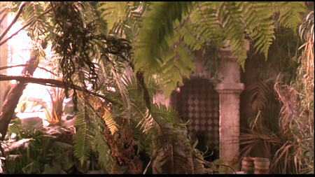


GREEN CARD
Remember this film? Remember Andie McDowell (Bronte) fighting to keep her New York apartment, simply because it had a luscious rooftop garden? Remember the indoor atrium with the sprinkler system and the hand-tiled pool? I would have married Gérard Depardieu for that apartment too. Then again, I always had a soft spot for Mr Depardieu. He can tend to my herbaceous borders any day.


HARRY POTTER
I was watching the Mandrakes-in-the-greenhouse scene from Harry Potter on TV tonight, and I realised I was more enthralled with those enormous conservatories that the storyline. The aerial shots were amazing.


THE SECRET GARDEN
Frances Hodges Burnett's classic novel has been adapted to the big and small screens more times that my garden has grown weeds, but it's still a great story. There are few things more irresistible than a hidden door to a secret walled garden. {All scenes from the movies indicated.}

Tuesday, February 21, 2012

Is Periwinkle The Perfect Blue?


It's a tough discussion, the Blue Debate. I mean, how do you possibly choose the perfect blue?

There's the sophisticated, dignified, thoroughly distinguished blue that is navy. (Which I have always had a soft spot for. And I suspect half of Paris does too, judging by their wardrobes.) There's the rich glamour of royal blue. There's the crisp smartness of French blue, which always reminds me of dress shirts and school uniforms. And finally, there's the soft elegance of periwinkle blue; a blue that's so quietly beautiful, it makes all other blues look flashy by comparison.

Some people think periwinkle blue is simply a pale, watered-down blue, but it actually has a hint of mauve swirled through it. It's a delicate blue and it can be difficult to do. If the paint is tinted too dark it can turn out to be lavender. Too light and it fades to a wishy-washy shade.

It can also be difficult to decorate with, or dress in. Many designers and decorators suggest using it as a dominant feature, which shows off its loveliness, rather than hiding it behind another principal colour such as white. Personally, I love seeing it with a sweep of glossy black; a colour combination that's unexpectedly glamorous and surprisingly sexy.

However you feel about periwinkle (or plumbago, porcelain, sky blue, or whatever else you want to call it), one thing seems certain: it's sneaking its way into the fashion and design worlds. Just look at how much of it was in Chanel's Spring-Summer 2012 show. In fact, many people think that pale blue, and its equally delicate and elegant cousin pale turquoise, could be the colour(s) to watch in 2012 and 2013. {Above image via the inimitable Rodney Smith.}


"It's an ahhh colour! Completely uplifting!"  
– Designer Jamie Drake on pale blue


The new Mondrian SoHo hotel, in New York, a poem to periwinkle. {Via Mondrian and Hotel Chatter}


Chanel's Haute Couture Spring-Summer 2012 show, which was more or less a tribute to the prettiest, palest shades of blue. {Via Chanel}


The Hotel Ferrero in Valencia Spain, which is owned by Spanish tennis champ Juan Carlos Ferrero. Look at that blue. It's so unusual for a hotel facade, isn't it? But so perfect for the elegant architecture, the petite size and the gorgeous, glorious, sun-kissed Spanish setting. {Via www.hotelferrero.com}


Pale blue in a French-style interior. I've misplaced the credits for these images and I wish I hadn't because I adore this space. Look at the silk-taffeta drapes, the high-gloss floor, the stunning armoire... If you know whose home this is, please do let me know so I can credit accordingly.


My old apartment in South Yarra. The stripes on the walls were painted in Porter's Paints' Nebular blue (low sheen and pearl gloss), which gave the tiny space the feel of a French salon. (Curiously, it also made the space seem larger.) Oh, how I loved this blue! I'd love to do another apartment in the same colour palette.


JK Place hotel in Florence. I never tire of staring at this beautifully designed space. In this image, the blue looks more turquoise, but in real life it's a pale blue. And while not strictly periwinkle, it's very much in the same family of pale blue hues.


My favourite Jonathan Adler sofa. In fact, this could be my favourite sofa ever. Look at those sexy lines. Doesn't it make you want to pour a martini or a gin and tonic, slip into a white silk dressing gown and spend an entire evening watching episode after episode of Mad Men? {Via jonathanadler.com}


A few of the spectacular pieces from Oscar de la Renta's recent collection. Oh, Oscar. You do know how to do a magnificent blue! {Via Vogue and Dustjacket Attic}


Chanel's alluring blue nail lacquer, highlighted at the recent Haute Couture Spring-Summer 2012 show. {Via Chanel}


The Kelly Wearstler-designed restaurant, BG, at the top of Bergdorf Goodman department store in New York. This is one of my favourite restaurants in New York. The views up Fifth Avenue and across Central Park are as sublime as the interior. {Via Apartment Therapy and Carlos Melia}


The Hotel de Vendôme in Paris. Flashy, but still fabulous. {Via Vendôme}


A print of Lulu Guiness's London home by the talented Anne Harwell of Annechovie. {www.annechovie.blogspot.com}

And more inspirations...


Paris Through Hue-Coloured Glasses...


I love stumbling across gorgeous blogs about Paris, especially if they do aesthetic justice to the city and its glamour and grandeur. Nichole Robertson's blog littlebrownpen.com is simple but full of colour, life and Parisian charms. It's so enchanting, Chronicle gave her a book deal.  It was well deserved. I can't wait to see her photos in print.

I was thrilled to see that one of Nichole's favourite colour combinations is also one of mine. Pale blue and gold isn't a duo that pops up in many people's Pinterests or mood boards but it's starting to be noticed. I've seen glimpses of it in several blogs and magazines lately, perhaps because – like sorbet between courses – its quietly elegant shades offer a visual relief from the bright, bold, saturated colours that are in the design world's focus right now, such as green. (On a little aside, have you seen House Beautiful's March 2012 cover on green? If we keep this up, we'll all be over green by May!)

Pop by Nichole's blog, Little Brown Pen, for some Parisian prettiness. And if that inspires you, pop over to another great Paris website called Hip Paris – hipparis.com – for some more French fantasies. It's where I discovered Nichole this morning, and it's where I go to get a fix of Paris when I can't quite get to the Rue du Bac!


Saturday, February 18, 2012

A Gilt(y) Complex: Why Gold is Growing On Us


Barbra Streisand and the Bee Gees sang it best. We got nothing to be sorry for. And we got nothing to be gilty of. Not when it comes to a love of gold.

It may be a reflection of the current value of this precious metal (which continues to escalate), or it may just be that gold gives a shimmering, sexy edge to a room. Whatever the reason, gold is showing up everywhere in the the design world this year, from furniture to fabrics, paint effects, vintage mirrors, lighting and even bathtubs.

Many years ago I attended the launch of Christian Dior's J'Adore fragrance. It was the most spectacular launch I've ever been to. As we were standing around a swimming pool full of liquid gold, sipping Champagne from crystal glasses, the supermodel Carmen Kass suddenly emerged from the liquid gold pool, and then, with gold dripping from every perfect bone, walked up the steps of the pool and out the door, a trail of J'Adore wafting behind her. None of us could figure out how she got into the pool (obviously through a trap door in the bottom) and how she pulled off such am amazing entrance without drowning. In saying that, wouldn't be a fabulous way to go?

Here, in a tribute to the most glamorous, most fabulous colour sparkling in all the most glamorous, fabulous rooms at the moment, is a quick medley of Golden Hits for you. {Source for image at top unknown.}


No one does gold quite like the French. Just think of Versailles. Here, a grand Parisian apartment has been elevated to an even more sophisticated level with the addition of gold silk-taffeta drapes hung theatrically between the rooms. {From Taschen's Paris Interiors book.}


A gilded salon in the heart of Paris. You can rent this apartment for the week. Can you imagine the decadent time you could have here? {Voltaire apartment via www.chezvous.com}


Another gold-tinged treasure from Chez Vous. This one is also available to rent through this lovely company. {Via www.chezvous.com}


A marble garden table with dainty gold legs makes this artistic studio an elegant space in which to work. {Via Carolyn Quartermaine.}


A gilt armoire. How utterly glamorous. {Source unknown}


A vintage gold mirror and an ornate gilt chair add a touch of elegance to Carolyn Englefield's Parisian bedroom. {Source unknown}


A golden Louis chair upholstered in Carolyn Quartermaine fabric creates the perfect exclamation mark for the beautiful design narrative of this gilt-edged bedroom. Love those hot-pink silk-taffeta drapes. {Via Carolyn Quartermaine.}


Gold makes an entrance – literally – in this hallway. I just adore that antique light. {Via Veranda magazine, February 2012}


This image of Charles Spada's Normandy home has been EVERYWHERE these past few weeks, but it's not surprising. Doesn't it make you look twice? Even if you have an aversion to leopard print, you have to admit that this space is truly, heart-stoppingly glamorous. The Gustavian-grey walls, the unusual fabric on the sofa, those lovely black-and-white prints in antique gold frames... It's French and yet comfortable at the same time – two words you don't often hear in the same sentence... {Via Veranda magazine, February 2012)


A gilt bathroom from the palace of Versailles. Look at that panelling...


The most beautiful store in the world: Balmain in Paris. {Via The World of Interiors and Veranda magazine}


The inimitable style of Max Alto. {Via Max Alto and Space Furniture.}

Related Posts Plugin for WordPress, Blogger...