
With all due respect to the judges, I can't imagine how any renovator could make a profit margin using this rule. We bought our house for $400,000 a little over a year ago. (An incredibly cheap price for Melbourne property.) If we'd spent $80,000 on renovations, we wouldn't be looking at much profit at sale time!
I suggest you try to stick to a 2-Per-Cent Renovating Budget. It's a painful prospect, I know, but it's the ONLY way to renovate. In the past 12 months, we've spent no more than $10,000 on renovations, and that includes: paint, tradesmen, new carpet, a new deck, a new ducted heating system, new curtains/drapes for 10 rooms, new exterior window awnings, updated fittings and even all landscaping. (Excludes furniture and mortgage repayments.) We've updated a five-bedroom, two-story, 16-room house on half an acre of gardens on a meagre 2-per-cent budget, rather than a 20-per-cent one.
It takes a LOT of DIY, but you can do it too. I promise!

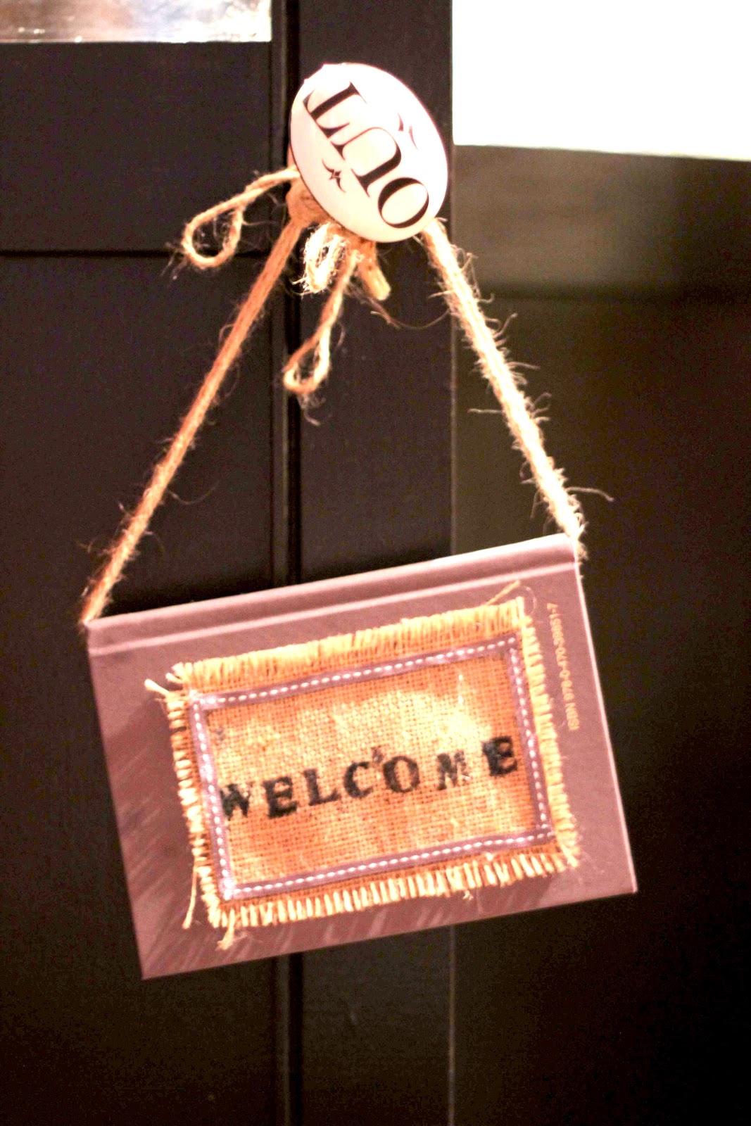
BEFORE: THE ORIGINAL BACK DOOR
The deck was so rotten it was a wonder we didn't all fall through on Inspection Day. The furniture belonged to the former owners. Lovely. I think this paint colour is called "Baby Vomit Pink". I may be wrong. But it looks suspiciously like it.
As you can see, our real estate agent Michael is high-tailing it outta there!

AFTER: THE NEW BACK DOOR
With a slap of French grey and cream paint, some greenery (hydrangeas, wisteria and jasmine), a vintage wicker chaise and some leftover charcoal fabric whipped up into drapes (which need to be ironed, sorry!), this is now a cute entertaining courtyard.

BEFORE: THE ORIGINAL FORMAL ENTRANCE HALL (DOWNSTAIRS)
There were 9 rooms of this pine panelling. I kid you not. NINE! I hadn't seen this much pine since I lived on the edge of a Scandinavian forest.

AFTER: THE NEW FORMAL ENTRANCE HALL (DOWNSTAIRS)
Some Kate Spade-inspired colour, some hand-made ottomans covered in black-and-white Ralph Lauren houndstooth, two vintage Belgium posters featuring leaves (from one of my favourite Melbourne stores Izzi & Popo) and a cheap Ikea striped mat...
So easy!


BEFORE: THE ORIGINAL BACK ENTRANCE HALL
The layout is confusing, I know, but this is the entrance from the deck and the carport, and we use it all the time as it's easier.
Look at that – more pine! I think I have a pine headache coming on...


AFTER: THE NEW BACK ENTRANCE HALL
More Kelly-green colour (inspired by our garden), a colonial style table and chair, another cheap Ikea mat, and a few metres of black-and-white lino at $44/m thrown down on some masonite base. (If we'd followed the 20-Per-Cent rule, we could have afforded black-and-white checkerboard tiles. But lino it was... )
Note: Some people think checkerboard lino should be laid on the diagonal. But you don't have to. In this case, it would have clashed with the diagonals on the walls.)
Note: Some people think checkerboard lino should be laid on the diagonal. But you don't have to. In this case, it would have clashed with the diagonals on the walls.)

BEFORE: THE GARDEN LIBRARY (DOWNSTAIRS)
Oh my, look at that. More pine.
The old owners had teenage boys and they used this room as a gym/car-repair workshop.
It STUNK of car grease, sweat and teenage boys.


AFTER: THE GARDEN LIBRARY (DOWNSTAIRS)
After four coats of paint and a LOT of air freshener, this is now the garden library and my office.
(Sorry about the blurry pix; had puppies jumping around my feet. This was not a very professional shoot!)

BEFORE: THE OLD TOP BEDROOM
The furniture belongs to the former owners. (I think they'd already moved a lot of stuff out when we bought it, and these were camping lilos.) Those at those vertical blinds. Mm-mmm.

AFTER: THE OLD TOP BEDROOM
– New paint (Barrister White – a softer white than Antique White USA, and less cold on the eye).
– A newly painted set of drawers (semi-gloss black, which is a better finish than full gloss).
– Some vintage bits (a black folding screen made from old shutters bought from an old French chateau).
– And some favourite photographs, including some from one of my most-loved fashion photographers, Bruno Benini.
{Will post photos of the front of the house, the living areas, the kitchen/dining and the garden later this month. Promise I won't post any more photos of pine! Or, indeed, of these spaces.}
That's amazing, what a difference some paint and curtains make. For years I have looked for black/white lino, could never find it without marble type effects!! Ended up painting the floors black and white!
ReplyDeleteDid you replace the boards on the back verandah? Can you come and do mine please...please?!!!!!
Janelle - thanks for sharing these pictures. The transformation is amazing...even more so considering your 2% budget. I particularly love the green in your entrance halls. I probably wouldn't be brave enough to try such a strong colour but it looks fabulous!
ReplyDeleteI'm looking forward to seeing the next post.
Happy new year you two lovely ladies! It's so nice to have such lovely readers. Thanks for the kind comments.
ReplyDeleteJulienne, we sourced our black-and-white lino from Bunnings. You buy it in 3-metre widths (and it's $44 per lineal metre, so you get a lot for your dollar). It doesn't have that horrible 1970s marble effect and when it's clean (ie no puppy dog feet) it looks really smart. We laid ours out at 5am one morning before a magazine crew came; we just threw it down and cut it out. So easy!
As for the deck, we had a tradie in but I helped him. You just rip up the old boards, buy the new ones (matching) from Bunnings and nail them down. Most people stain their decks but we painted ours. Probably a crazy idea... Honestly, if I can do all this, anyone can!
PS Some designers believe checkerboard lino should be laid on the diagonal, as it draws the eye through the room, but I say pfffff to that. If we'd laid ours on the diagonal it would have clashed with the diagonal boards in the walls. Then I really would have had an interior design migraine!
ReplyDeleteI've just woken MOTH up from his snoring slumbers in the chair next to me with a good thump from my iPad to see this post urgently. 'Look at Janelle & PB's house it's awesome, aren't they clever!' He totally agrees with me, but having seen those gorgeous B&W tiles is now worried that you are Collingwood supporters.
ReplyDeleteMillie xx
Dear Millie, Wait until you see the pix of the living room and kitchen. Then you really WILL think we have gone overboard on the black and white. In our next house I've promised RR we are doing more COLOUR. He says he'll believe it when he sees it.
ReplyDeletePS Yes, I was a C'wood supported - until they won. Then I felt they were a little arrogant. Sorry to all C'wood supporters out there.
Amazing transformation. So inspiring! Cant wait to see your next post. You have such a great eye for interior design. Cannot believe how much you've done on a 2% budget!
ReplyDeleteHi, great transformation. Could you please tell me where you bought the country life poster/print/painting ?
ReplyDeleteHi Anton,
ReplyDeleteThanks for your kind note. I actually painted the Country Life painting. You're very welcome to buy it. I'm not sure where you live but if it's in Victoria Australia you can have it for $60 plus postage. We have decided to move and the place we may be moving to has limited space, so we are about to have a huge clesaring-out sale! Everything in the house may have to be sold. (So if there's anything else you want, make me an offer.) I will be doing a full "Garage Sale" post this week with all the details. Janelle
Thanks Janelle, I was hoping to get paintings of my favourite penguin novels. I have since seen a DIY video on good old you tube so I think that I will attempt a copy of my favourite novel "The Blessing" by Nancy Mitford. Now I have to find the perfect penguin orange paint.
ReplyDeleteAny hints appreciated !
Cheers.
A
You're welcome Anton. Those Penguin book covers are VERY easy to do. Just buy some canvas (pre-done on a timber frame) from an art supply store (I bought mine at Bunnings hardware store), and then pencil the outline in. Those covers are easy to copy. Then use any kind of paint - I used leftover gloss from painting the house! I used a navy blue, even though the 'real' covers are often in orange. The type is the most difficult part (getting it perfect); perhaps you could use stencils or some other craft devise to make it easier? Good luck! Email us a pic when you're finished!
ReplyDeleteJanelle
Absolutely amazing transformation. You've done such a great job with all the rooms and your garden too. So industrious! It's just beautiful x
ReplyDeleteYou probably won't see this but omg love this before and after!! You have a great style!
ReplyDelete