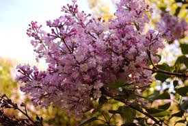
Have you noticed? Colour is making a bold comeback, pushing aside the long-lasting trend for beiges, greys, greiges and all those other Frenchy shades. One colour in particular is proving strong. It's the colour that author Alice Walker made famous, the colour Roman Catholic bishops are rather fond of, the colour of new-summer salvias and the admirably hardy stalwart of many Australian gardens, the Veilchenblau rose, and the colour long associated with not only piety and royalty but also growing older gracefully... (Just ask the Queen.)
Yes, it's that greatly misunderstand colour, purple.
Pantone, those people who bravely predict the colours that we'll be wearing, decorating with, or indulging in during the forthcoming year, have courageously put their heads up above the colour parapet and said "hallelujah for purple hues". They've named one purple, in particular, Radiant Orchid, as being Colour of the Year 2014, forecasting that it will be up there as a pre-eminent hue for the next 12 months.
(Much of Prada, Chanel and Dior's Spring 2014 fashion collections featured a preponderance of pinks and purples on the runways.)
However, alongside all this purple prose, there's another colour that's creeping up in popularity; a colour that leading paint company Benjamin Moore predicts will have a far-reaching influence this year: sky blue. (Although Benjamin Moore has given it the more 'colourful' name of 'Breath of Fresh Air'.)
And so here, to celebrate the return of two rarely-used hues in fashion and decorating, is a small post on the splendour of powder blue and bold mauve. Er, sorry, Radiant Orchid. Hooray for the colour under-dogs, I say.
One of the most beautiful places to visit in London, the former stately home of Kenwood in Hampstead. Go along just to see Robert Adam's library and this room, above, which is the most ravishing shade. It's one of London's hidden gems – and it's free. How we love a free museum...
www.english-heritage.org.uk/daysout/properties/kenwood
A frock by one of New York's most under-rated fashion designers, Ralph Rucci, whose resort collections are always elegant. No wonder the Upper East Side socialites adore him.
www.chadoralphrucci.com
If you can't afford a Ralph Rucci off the rack, and you're nimble with a Singer, try the Vogue patterns. Mr Rucci normally does one or two designs for Vogue patterns a year.
This Ralph Rucci wrap dress pattern, above, makes the perfect gardening smock,
particularly in cotton duck, which is a great utilitarian fabric.
One of the most expensive paints you can purchase if you're an artist is Cobalt Violet.
(As I discovered when I went to purchase a tube last week, and was told it was $45. I thought she said $5 and carefully counted out some coins on the counter.)
Use it sparingly, if at all. In fact, at that price you'd probably just want to put it to one side and ponder its beauty while you used the cheaper paints...
Miranda Kerr's home, as photographed recently for cult international website The Coveteur.
It's a paean to pinks and purples.
(Thanks for showing my book Miranda; I was very touched to see it. But I would have put your amazing shoe collection first in the photo shoot. Covet is the right word.)
http://www.thecoveteur.com/miranda-kerr
The Lilac Walk in New York's Central Park.
Truly stunning.
(April / May is the best time to see it.)
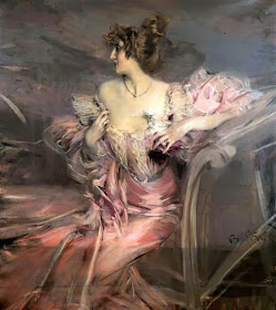
Have you read the fabulous story behind this painting? Some of you may have already read it, but if not, the link is here. (My sister-in-law just sent me the link this week: I hadn't read about it either.)
It's a truly extraordinary tale of a lavish Parisian apartment that was shut up and forgotten about for 70 years.
http://parisapartment.wordpress.com/2010/10/07/urban-archaeology-sleeping-beautys-paris-apartment-discovered/
If you really want to immerse yourself in Radiant Orchid, you could stay here: the Junior Suite of the Raphael Hotel in Paris.
www.raphael-hotel.com
Clearly, the Roman Catholic bishops recognise a fashion trend before the rest of us.
A few of us are getting ready for another Garden Tour in May this year, this time to the spring gardens of New York, the Hamptons, Connecticut and Savannah/Charleston. It's only a small tour – we filled the 15-seat bus through word-of-mouth – and it looks like being a lovely group. We learned a lot from the last tour and are endeavouring to make it better and more beautiful than England.
The one thing I'm worried about, however, is the dress code. The women on the May 2013 Garden Tour had THE most beautiful scarves – which were almost as beautiful as their wedding rings. (I was telling a friend this week about the 'tour rings'. "Honestly. Some of them were like the Hope Diamond.)
So I've pulled out my best scarves in preparation.
New York in spring.
Just beautiful.
(Photographed this year. Seems a long way from the blizzards hitting the city at present.)
Have you seen the new app called Waterlogue?
It's fantastic. It distills your ordinary, everyday iPhone photos into surprisingly beautiful watercolour-style works of art.
www.waterlogueapp.com
Poliform's new collection for 2014.
Mauve: How One Many Invented a Colour That Changed The World, by Simon Garfield
A fantastic book, which aesthetes and colour enthusiasts will love, about the history and significance of the colour mauve.
The sophisticated interior of the David Collins-designed Artesian bar in London.
The late David Collins loved the colour blue, but this project moved towards a prettier palette of white and wisteria. So beautiful, it was named The World's Best Bar for 2013.
www.artesian-bar.co.uk
Our home, where purple seems to have made a sneaky appearance in an upstairs bedroom...
Another view of the same bedroom, where a vintage blue-and-mauve Hermès scarf bought in Paris became the decorating cue for the room.
And our newly painted powder-blue library / living room.
The walls are done in Porter's Paint's 'Nebular', which is a pretty plumbago-blue shade, almost the colour of summer hydrangeas.
The pale blue linen slipcover for the ottoman is from Scarlett Jones' fabric store in Melbourne. They have lovely Belgium linen that looks like antique French linen.
The always gorgeous Boatshed at Balmoral in Sydney.
Every week the flowers here are spectacular – and always seem to perfectly match the aqua and pale-blue interior.
A famous image of some of the designs of couturier Charles James; the subject of a major Metropolitan Museum of Art Costume Institute exhibition this year.
Charles James: Beyond Fashion.
From May 8 until August 10, 2014
www.metmuseum.org
Speaking of sky blue, this is a perfect photo to illustrate the hue.
I had a few quick days away in the Whitsunday Islands before Christmas, to decompress after an intense and sometimes exhausting year. The view over the islands and the Great Barrier Reef surely has to be one of the most memorable in the world. I always go quiet when the plane flies over the bays and inlets of this incredibly beautiful part of Australia.
More sea-blue inspiration from the Whitsundays...
New York's coolly glamorous new hotel, The Marlton, which has lots of blue in the design palette.
The Greenwich Village location is superb too.
marltonhotel.com
It's 33 degrees Celcius here in Melbourne today. (92 Fahrenheit)
Off to make a G&T.


I can cope with radiant orchid but purple per se frightens me in three words; old smelly hippies.
ReplyDeleteWith apologies to Ancient Rome.
what old smelly senators with the purple striped togas?
DeleteI used to dislike the colour too Tabs. But it's growing on me. Don't forget it's the colour of good wine too. Just drink a few glasses and you'll soon be a (drunken) convert!
DeleteYou're clearly on trend Janelle with your new Provence book jacket being in purple! Or are you already on Pantone's payroll as a colour forecaster?! Beautiful collection of images... I do like amethyst mixed with brown tones in a room, but I hate to say it but purple is one of my least liked colours......Although I do own one purple dress, which may now be dragged out of the back of the wardrobe for an airing! xx
ReplyDeleteI can't take the credit for that Heidi – Pan Macmillan had the clever idea to do a purple book for Christmas. Wasn't sure about the cover, but it does look very 'Provence'.
DeleteAnd I agree – purple is a hard colour to decorate or dress in. But I've just seen THE most glamorous older woman in Safeway wearing deep purple with flowing white palazzo pants and pearls. She looked like something from a FS Fitzgerald novel set on Cap d'Antibes... x
Unlike Tabitha I can't cope with the Pantone shade ..it seems so flat . I do however love deep purples (ha!!)
ReplyDeleteYesterday I perused your Provence book in an Avalon (northern beaches of Sydney) bookshop ..luscious in the extreme and a bookmark!
The Paris apartment captures the imagination doesn't it ?..its sleeping beauty well she is there in the Boldoni portrait
Yes, the Paris apartment story is a great story, isn't it? Who paid the rent all those years?
DeleteSo nice of you to pick up the book. Lots of gorgeous books on the shelves at present. About to read The Book Thief. Realised I was the last person in the world to do so. x
Unlike Tabitha I can't cope with the Pantone shade ..it seems so flat . I do however love deep purples (ha!!)
ReplyDeleteYesterday I perused your Provence book in an Avalon (northern beaches of Sydney) bookshop ..luscious in the extreme and a bookmark!
The Paris apartment captures the imagination doesn't it ?..its sleeping beauty well she is there in the Boldoni portrait
Your photos have made me rethink Radiant Orchid. I bought a Pantone sample last weekend and my business partner and I tried it out. Once we actually painted something with it, we looked at each other, and said, "Maybe for a nursery or a girl's room..." However, there was no conviction in our voices and I think our noses were rather wrinkled as we spoke! Now I want to rethink it a bit, and actually try it on a whimsical piece of furniture. Who knows?
ReplyDeleteSo funny. It IS a difficult colour, isn't it? So bold... I love it best with orange and/or white (see the Roman bishops for inspiration), however I also really liked it with pale/periwinkle blue in the above photos. And of course the gilt frames really stand out on the plum walls in Kenwood House. I wonder if you need to tap into its 'shock' value and do something really outrageous (like mixing it with orange)? My study has lots of that shade of pink/purple, but there are touches of orange and red, with chocolate blinds/chocolate carpet to tone it all down, so it's not too OTT. It's not disconcerting to work in at all. (Just the piles of work are off-putting!)
DeleteThanks for your input; so lovely to hear from readers.
Janelle, Janelle, Janelle,
ReplyDeleteHave you ever done your gardening in a pale blue linen smock? OMG! You should see me in old yoga pants, stained T shirt and work boots!
Fiona
Fiona, Fiona, Fiona. You would look beautiful even in a swathe of hessian or canvas!
DeleteI agree that the pale blue gardening smock may not be suitable for tossing chicken poo over the roses! But I'm sick of ruining good sun dresses so I thought I'd try and make a 'proper' old-fashioned gardening frock. It was inspired by both the Duchess of Devonshire and the beautiful book 'Garden People'. Spotlight had a sale on both duckcloth and linen (the khaki and navy were gorgeous) for $10, so they may just do the trick! Will let you know how they go.