The design world's current passion for green – particularly emerald green – appears to show no signs of abating, with increasing numbers of shelter and fashion/style magazines devoting column spaces to its fresh, modern, slightly whimsical and surprisingly elegant feel. In fact, some magazines are suggesting it could be the colour to watch this year – even more than Pantone's predicted Tangerine Tango forecast.
Now bright green isn't for everyone – I know people who avoid it like the proverbial plague – but I adore it. And I know many others do, too, including Kelly Wearstler, Kate Spade, Windsor Smith and Alison Pincus of One Kings Lane, as evident by her glorious hall, below.
Here are a few more images of this sassy, sophisticated shade. Let's see if you can be persuaded to join the Green Brigade!
The San Francisco home of one of the founders of One Kings Lane, Alison Pincus, which has just gone on sale. Spectacularly vibrant. {Via Hooked on Houses}
The whimsical, tropical, truly glamorous Martinique Banana Leaf wallpaper, which was first made famous by the Beverly Hills Hotel and is now showing up in lots of other lovely hotels, such as this one.
It's also being seen in some seriously stylish interiors, such as Nate Berkus' Milan apartment. {Via Elle Decor}
And at New York's Indochine restaurant. {Via Wall Street Times}
The now iconic Reception of the Viceroy hotel in Santa Monica, LA. I adore those mirrors. (How very LA.) And the emerald leather chairs are fantastic pieces for welcoming guests as they check in. Much nicer than standing up at a overly high reception desk! {Via Viceroy Santa Monica}
Emerald and black and white always look crisp and chic together, and this bedroom shows how glamorous the combination can look. (I've mislaid the credit for this, so please remind me if you know where it comes from. Looking at it, it appears to be one of the suites of the Viceroy Santa Monica.)
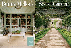
A rare glimpse of Bunny Mellon's sublime green conservatory, which was photographed for Vanity Fair. {Via Vanity Fair}
A geometric green desk, a green Moorish-inspired design on the wall and some carefully selected pieces elevate this office to a truly inspirational space. {Via House Beautiful}
Who would have thought a green kitchen would look amazing? This colour is more of an olive green than emerald, but the painted cabinetry and checked ceiling really create a dazzling space – part country, part contemporary, and completely, utterly startling. {Via House Beautiful}
It reminds me of the gorgeous green dining room of Bistro Guillaume in Melbourne, here –
Bistro Guillaume in Melbourne. I've been wanting to go here for dinner for years, mostly because of the beautiful and unusual interior design! I've put it on my "Wish List" for my birthday in February, so will let you know if the food is as fabulous as the decor. {Via Bistro Guillaume}
I love this spread from Red magazine. Look at the luscious little VW! How cute is that for a weekend away?
Windsor Smith's entry hall. This must be one of the most beautiful halls ever designed. Simple. Thoughtful. Sophisticated. Inviting. And oh, so enviable! You know what makes this hall so gorgeous? The accents of green against the dramatic blacks and whites. {Via House Beautiful}
The front door of Sydney stylist Sibella Court's store, Society Inc. Now there's a door to adore!
One of the most enchanting little guesthouses in the world, the cutely named Bed of Flowers in The Netherlands. {Via Bed of Flowers website – www.bedofflowers.nl}
One of my favourite new fabrics and wallpapers, this print is called 'Woodland Fern', and it's from the range 'A Painter's Garden' by Sanderson. So pretty. {Via Sanderson}
And lastly, two of my favourite magazine covers, the much-missed Domino with India as cover girl, and Town & Country – with a surprisingly un-Town & Country cover! Love that emerald gown!


Gorgeous! Thanks for your lovely blog, which I look forward to reading. Keep up the good work - and have a great 2012. E
ReplyDeleteWowee, what a fabulous post Janelle except for one thing - I have a complete aversion to green! Of course this is not YOUR fault, I probably need some therapy to root out the origins of this weird dislike. In saying that however, the reason we bought at Stirling was the amazing verdant green lushness of the garden which jumped into the house via the huge windows.....go figure!
ReplyDeleteMillie xx
P.S. I have it from an inside source that the gorgeous Guillame's new bistro venture is the bomb, better than his original fine dining concept. I've looked into Mystic Millie's crystal ball & see a tall, cute, red-headed man making a booking & my predictions are never wrong.
Official or unofficial... I love it... xv
ReplyDeleteI've always been a green girl!
ReplyDeleteThese are lovely images.. Have used green in interiors but sort of murky greeny shades. Particularly love Windsor Smith's entry hall - perfection.. And I so miss Domino too and especially Rita Konig's articles. x
ReplyDeletep.s. your suggestions for Hobart were SPOT on, thanks so very much. xxx
Ladies, I can relate. I used to have a strong aversion to green, too. But then we moved to a country house in a village surrounded by rainforest. The landscape here is saturated in green! And I guess looking at it everyday had an effect on us...
ReplyDelete